

Exuviance Proposal
Exuviance recently went through a makeover where they changed their logo, color palette & even product packaging from poppy cyan and blue, to now calmer nudes, blush, and white. However, I still felt like there’s a missed connection between product packaging and new color palette used. It’s apparent that the packaging designers are going for more elegant and toned down colors over colorful and saturated, which is still displayed on their page below under “before”.

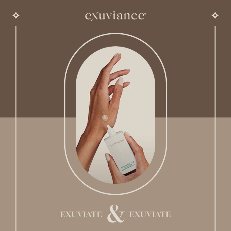
Instagram Aesthetic Refresh
For the campaign, I chose the same copy and purpose of some of their existing posts and reimagined them into a new aesthetic. They had a campaign called “Exuviate” that I decided to carry. I chose the color palette and new aesthetic based on skin tones since the brand/client is very skin care focused. I chose bold and confident models with high contrast to really capture the boldness of the brand while maintaining elegance. The new color palette/aesthetic really connects the product/packaging design and drives this brand home.


Email Aesthetic Refresh
I email subscribed to Exuviance to see their current aesthetic (below, under “before”) and decided to redesign the “welcome” email, instead of having to use Lorem Ipsum. That way the design exercise is more challenging, giving myself the boundaries of the design elements and copy used in the “welcome” email. This email is not as much focused on the brand refresh, but can easily be swapped with a new copy to reflect it.
As seen below, under “after,” I carried the new design elements, fonts, and color palette introduced through the instagram posts above to make that connection and bring that new campaign alive.